


Scope of Work
Rebranding
Logo
Brand Identity
Segment
Construction
B2B
Country
Russia

Client
KING
The Challenge
Rebrand the company to preserve its core essence while achieving a more serious, professional look.
Branding for KING Construction Company
KING is a construction company specializing in construction process control. My task was to create a brand that visually communicates control, authority, and absolute confidence in the result.
Before

After


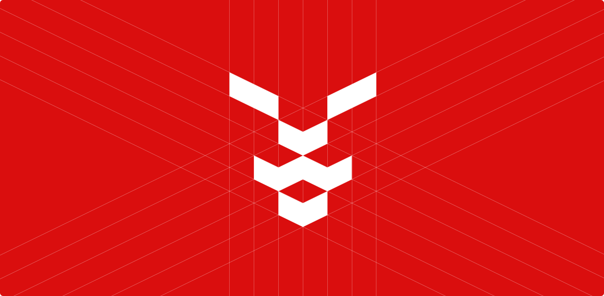
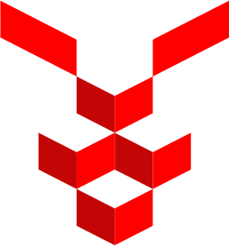
Logo Meaning
At the core of the mark is a stylized lion’s face, reimagined through strict geometric forms. The lion, as an archetype of strength, power, and control, defines the brand’s character, while the graphic interpretation reinforces a sense of precision and composure.
The logo conveys confidence, dominance, and absolute command over processes.

Colors
The identity is built on the contrast between rich red and graphite gray. Red reinforces the sense of control, signaling attention to detail and responsiveness, while gray adds a sense of status and trust. This combination creates a strong visual code that is easily recognized and remembered.
Gray
8E8E8E
Silver
E4E4E4
White
ffffff
Graphene
232323
Blood Red
DA0E0E
Typography
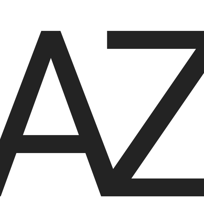
The typography supports the overall brand character — confident, strict, without unnecessary decorative elements. It reinforces a sense of discipline, order, and structure — key qualities for a company in the construction control industry.

typeface

Key Visual
The Key Visual is built on contrast, rhythm, and large-scale graphic accents. It creates an expressive visual environment where confidence and control are clearly perceived.
Compositions are structured to hold attention and convey the brand's dominant character.

Applications
The identity is implemented across the brand’s key touchpoints — from workwear and documentation to outdoor elements. The bright red color ensures high visibility within the construction environment, setting the brand apart from other participants in the process and strengthening its presence on-site.

Logo Adaptability
The mark adapts to the task at hand: it functions as a logo on brand touchpoints and recedes into the background as a pattern — reinforcing the brand’s visual environment. The system remains cohesive at any scale and in any context.
Result
As a result, I created a strong and expressive brand with a clear market position: KING is perceived as an independent control authority, setting quality standards in the construction industry.
The identity creates a sense of power, order, and complete control over processes, strengthening trust in the company and enhancing its value in the eyes of clients. The visual system works as a tool of influence — setting the brand apart from competitors and establishing its status as an expert.

