Scope of Work
Logo
Brand Identity
Segment
Industry
Manufacturing
B2B
Country
Russia

Client
IRONMEBEL
Challenge
Move away from the "90s factory" image (heaviness, outdated aesthetics, lack of systematic design) toward a modern, technological positioning — one that matches the company’s real status as a market leader and the quality of a product built to last for decades.
Branding for the Metal Furniture Manufacturer IRONMEBEL
IRONMEBEL is a serious Russian manufacturer of metal furniture for business. Their furniture lasts for decades — this is their key competitive advantage.

Свайп влево

Logo Meaning
im
m
i


+
=

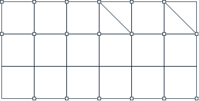

Modular Structure
The mark/system is built on a modular grid — a base element that scales and combines across different media (catalogs, documentation, showroom, specialized equipment). Modularity reflects the product itself — a system of unified components that come together to form a complex yet precisely engineered structure.


Base Module
Deep Blue
Secondary
HEX 001628
RGB 0 / 22 / 40
RGB 0 / 22 / 40
Blue
Secondary
HEX 0067B6
RGB 0 / 103 / 182
RGB 0 / 103 / 182
Vivid Red
Primary Accent
HEX FF0000
CMYK 0 / 100 / 100 / 0
RGB 255 / 0 / 0
Pantone 485 C
CMYK 0 / 100 / 100 / 0
RGB 255 / 0 / 0
Pantone 485 C
Primary
Navy Blue
HEX 002139
CMYK 100 / 42 / 0 / 78
RGB 0 / 33 / 57
Pantone 2955 C
CMYK 100 / 42 / 0 / 78
RGB 0 / 33 / 57
Pantone 2955 C
Color Palette
Navy Blue (primary) — depth and reliability, conveying status without the brutality of black. Vivid Red (accent) — energy and modernity, breaking up monolithic weight and signaling "not a 90s factory." Blue and Deep Blue — shades of blue for systemic consistency, without straying into unnecessary color families.
Bottom line: blue = trust and durability, red = modern confidence. This balance solves the challenge of "staying serious while moving away from an outdated image."


45° Bevel/Cut
A signature graphic technique used for accents and highlighting key areas.
Used for: — creating accent panels — stylizing photography — designing branded materials and details

Metal Shelving Unit
Industrial
3500


Pattern
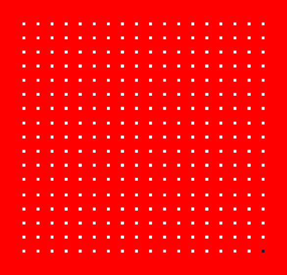
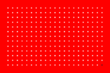
The Ironmebel pattern creates a direct association with the product — it echoes the perforation pattern found on the metal surfaces of the products.
The pattern is built on the logo's structure and repeats its modular grid.
The pattern always includes one accent point. It is positioned in the bottom-right corner and highlighted with color.


Result
An identity that speaks the language of a B2B leader: rigorous, systematic, modern — free of 90s visual noise. It builds trust with major clients and underscores the company's status as a titan of the market, not just "another furniture manufacturer."